Steam is miles ahead of its competitors from the likes of Origin and Epic in terms of games availability, functionality, support, community, and more, and there is no denying that fact. But, one department the giant game distribution platform by Valve could use some work is the user interface. The UI is unapologetically outdated, especially considering that not much of it has changed in the past 15 years. But, that’s about to change pretty soon, at least according to a source familiar with the matter.
We’ve been hearing about a potential redesign for a long time now thanks to a bucketload of rumors and leaks. Back in January, Steam in a blog post confirmed the update along with early sneak peeks at some of the incoming features including an updated library, improved events system, better game discoverability feature, new Steam Chat mobile app, Steam Trust, Steam PC Cafe Program, and more. As if that wasn’t already enough, a recent leak courtesy of Steam DB has even revealed pretty much everything we need to know about it. However, there’s been no information from Valve or other trusted sources as to when this update is going to roll out. At least, that was the case until now.
Android Marvel has learned through a reliable source that Steam will be rolling out a new beta release with the said features from early August to beta participants. So, if you’ve signed up for Steam Client Beta, you may want to keep an eye out for the upcoming update. The exact reason why it’s been taking so long for the update to roll out is not known, however.
What’s to be expected from the new Steam update?
Sure, the update hasn’t come out yet but we already know what is to be expected from the new UI overhaul thanks to a bunch of leaked screenshots posted by SteamDB.

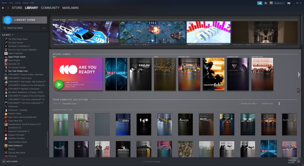
This image showcases the library page of the new launcher. The new library page seems to be using vertical rectangles in place of the older horizontal ones. It also incorporates the activity page into the library page making the community features much more accessible. This is a very welcome change and something that the community has been craving for, as the old community page is buried beneath the many pages in steam. It has also been reported that the new client will have much better organization options — you will be able to organize your games using many inbuilt categories, as well as make your custom categories.

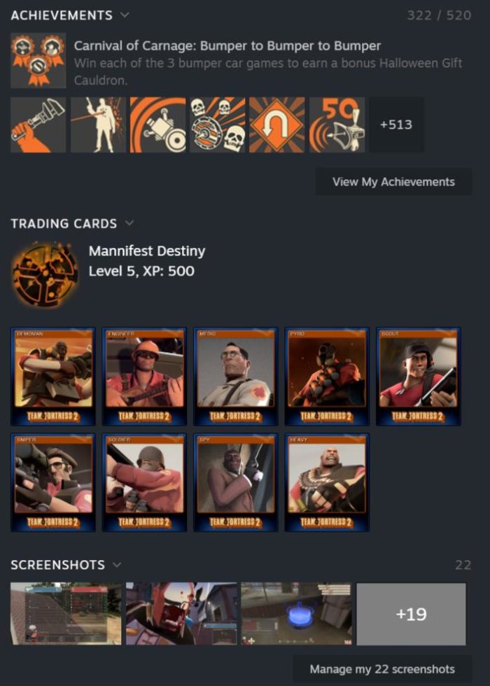
The above image shows the achievements, trading cards, and screenshots all built into the new library page. The trading cards also show a new floating effect when hovering over them as reported by SteamDB in their tweet.
The new Steam client is also rumored to be using a web-based UI like the new Steam chat that was rolled out last year. This should hopefully mean that much of the steam functionality will also be available through your web browser since no additional code is required to manage the two. Unfortunately, this might also mean that the new steam launcher will require more memory than the older client, as web-based UIs tend to be more memory hungry.
Feature image source: SteamDB/Twitter


