Google will soon roll out a redesign of the Google Home app, according to folks over at XDA Developers. The new design will go in line with the firm’s latest Material Design guidelines.
For the uninitiated, Google Home app lets you configure the firm’s smart speaker hardware including Google Home, Google Home Mini, and Google Home Max.
We’re not talking about a major design overhaul, but the new update will bring along some small UI improvements. Speaking of which, a bottom toolbar will replace the sidebar menu present in the current iteration of the app.
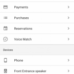
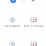
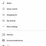
Other than that, both the ‘devices’ and the ‘settings’ pages now look a lot less crowded; thanks to the use of small icons in place of large cards and removal of dividing lines between options.
There’s no word as to when the update will hit the user devices as of now. So, for the time being, you can check out the screenshots (courtesy of XDA Developers) below to have an early look at what Google has in store for us with the updated Google Home app.
Source: XDA Developers


